When the Ratio Lies: The Denominator Problem Explained
How misleading metrics creep in when you forget to ask “out of how many?”
Fellow Data Tinkerers
Today we will look at how denominator change can trick up your analysis.
But before that, I wanted to share an example of what you could unlock if you share Data Tinkerer with just 2 other people.
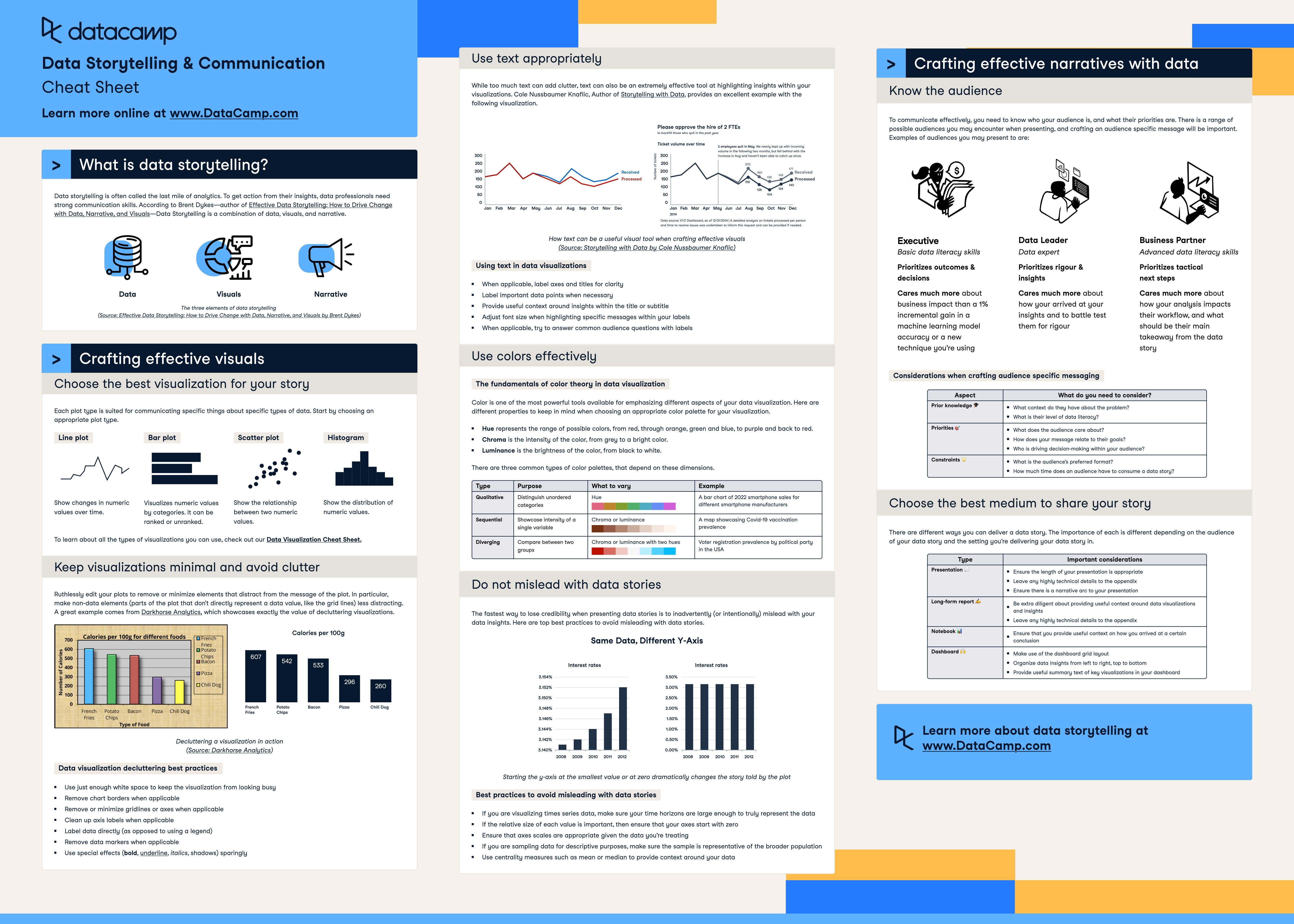
There are 100+ more cheat sheets covering everything from Python, R, SQL, Spark to Power BI, Tableau, Git and many more. So if you know other people who like staying up to date on all things data, please share Data Tinkerer with them!
Now, with that out of the way, let’s get to today’s data analysis article!
We all love a good ratio. Click-through rates, conversion rates, churn rates, refund rates. Ratios are everywhere in data. They're neat. They scale. They make bad things look small and good things look big.
But here's the catch: A ratio is only as honest as its denominator. And if you’re not watching that part closely, you might be celebrating a win that never happened or worse, missing the moment everything started falling apart.
Welcome to the Denominator Problem.
The dangerous simplicity of ratios
Ratios feel intuitive. "This thing happened X% of the time" sounds better than “it happened 34 times.” But if you’re only looking at the top part of the fraction (the numerator), you’re not seeing the full story.
Let me show you how this goes sideways.
A tale of two products
Let’s say you're a product analyst at a company with two products: Alpha and Beta.
"Both products are converting at 20%. Nice!"
But now the marketing team decides to scale Beta. They dump a ton of traffic into it and here’s what the next month looks like:
Now the ratio tells a very different story.
Beta’s conversion rate tanks from 20% to 1%, and it’s not because the product got worse, it’s because the denominator changed. A new traffic source came in and with it, lower intent users.
So what went wrong?
The numerator stayed high enough to feel okay (100 conversions! That’s growth!) But by not watching the denominator (10,000 signups) we missed the dilution effect.
This happens all the time:
A product looks like it’s improving because the raw numbers are going up, even as ratios go down.
Or worse, you celebrate an increase in the ratio but only because the denominator shrunk in a way that makes everything look better than it is.
Real world denominator disasters
Let’s make it real. Here are a few examples you’ve probably seen (or suffered through):
1. Conversion rates after a redesign
“Conversion rate is up 15% after the new homepage!”
What no one mentions: traffic dropped 40% because your organic SEO died. The people who do visit now are highly motivated so of course they convert better. The ratio improved but the business didn’t.
2. Churn rates that look too good
“We cut churn from 5% to 2%! We’re crushing retention!”
Also true: active user count dropped from 100,000 to 20,000 after sunsetting two products. The number of churned users is the same but now the denominator makes it look like a win.
3. A/B test “improvements”
One variant had 12 conversions from 100 users. Another had 6 conversions from 25 users.
"Variant B has a 24% conversion rate! It’s better!"
Except: the denominator is 4x smaller which makes it more volatile. And you haven’t checked statistical significance yet.
Why this happens (and keeps happening)
The denominator problem sneaks in because we’re wired to pay attention to change and ratios look like they give us the cleanest signal.
But here’s the kicker:
Ratios are only meaningful if you control for who and what goes into them.
Data teams often move fast. We run experiments, launch dashboards, track KPIs but without cohorting or segmentation, the denominators can shift under our feet.
Marketing adds a new channel. Sales changes their targeting. Product changes onboarding. Suddenly your “conversion rate” is comparing apples to traffic spikes.
How to avoid the denominator trap
You don’t need to ditch ratios. You just need to treat them like you’d treat any other sharp object: useful but not to be trusted blindly.
Here’s how to stay safe:
1. Always pair ratios with raw counts
Don’t just show conversion rate. Show conversions and traffic. Let people see what’s underneath.
2. Track cohort-level metrics
Instead of just “monthly churn,” look at “month 1 churn for February signups.” Same goes for retention, conversion, etc. Cohorts keep denominators honest.
3. Watch for denominator shifts over time
Did traffic double? Did targeting change? Did we get featured on Product Hunt? If the audience changed, the ratio probably did too.
4. Use control groups when possible
Even simple A/B tests help you control for changes in the environment that might distort your ratios.
5. Visualise both parts of the ratio
Stacked bars, line charts with dual axes, anything that shows how the numerator and denominator are moving separately.
Final thoughts
Ratios are seductive. They’re tidy. They feel like insight. But they hide more than they reveal unless you ask the critical question:
“Out of how many?”
So next time someone throws a shiny metric at you, pause. Check what’s in the denominator. And if it smells funny? Go digging.
Sometimes the story is hiding at the bottom of the fraction.
If you are already subscribed and enjoyed the article, please give it a like and/or share it others, really appreciate it 🙏
Keep learning
Freelancing in 2025 as a Data Analyst (Guest Post)
Ever wondered if freelancing in data is actually worth it or just LinkedIn hype?
This week’s guest post is a refreshingly honest look at life as a freelance data analyst, minus the sugar-coating. Amy breaks down what it’s really like chasing gigs, surviving radio silence and standing out in a sea of AI noise.
If you’re even thinking about going solo, you’ll want to read this.
When the Metric Becomes the Monster
Ever watched a team optimise a number straight into the ground?
This post breaks down how metrics turn into traps and how to avoid playing yourself.